- HomeHome
- InspirationInspiration
- Rooms To Go BlogRooms To Go Blog
- How to Choose a Color Palette for Your Home
Keys to finding a timeless interior design color scheme
Choosing the right colors for your home can feel overwhelming, but the color wheel simplifies the process into something anyone can master.
Originally developed by Sir Isaac Newton in 1666, the color wheel is a circular diagram that maps the relationships between primary, secondary, and tertiary colors. Understanding relationships between colors helps you build room palettes that feel balanced, intentional, and uniquely yours.
At its core, the wheel starts with three primary colors: red, blue, and yellow. Mixing two primaries creates secondary colors (orange, green, and violet), while blending a primary with an adjacent secondary produces tertiary colors like teal or coral. For home design, the color wheel matters because it takes the guesswork out of pairing colors. Instead of relying on instinct alone, you can use established relationships on the wheel to create palettes that are visually harmonious.
Three core color schemes form the backbone of most successful home palettes. Each creates a distinct visual effect, and knowing when to use them gives you flexibility across every room.
| Scheme | Colors Used | Best For | Mood |
|---|---|---|---|
| Complementary | Opposites on the wheel | Living rooms, dining areas | Bold, energetic |
| Analogous | 2-3 neighbors on the wheel | Bedrooms, reading nooks | Calm, cohesive |
| Triadic | 3 evenly spaced colors | Kids rooms, playrooms | Vibrant, balanced |
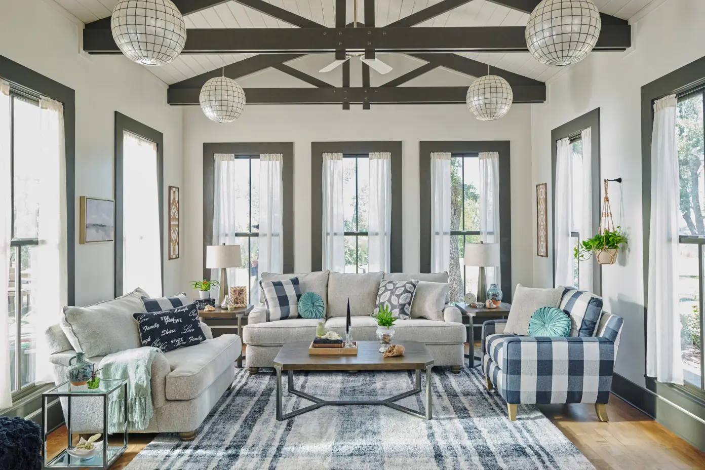
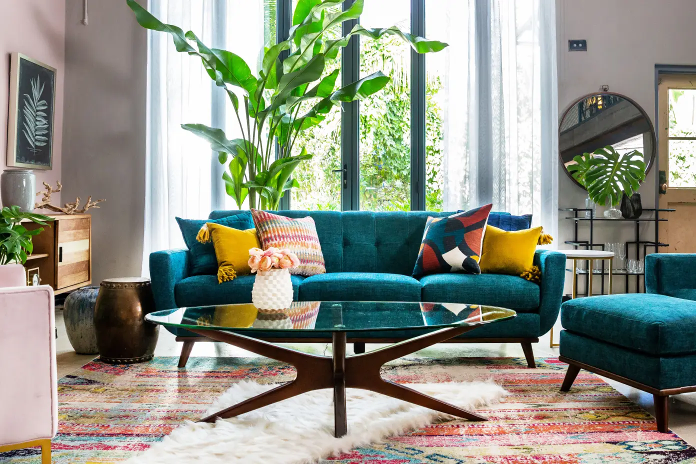
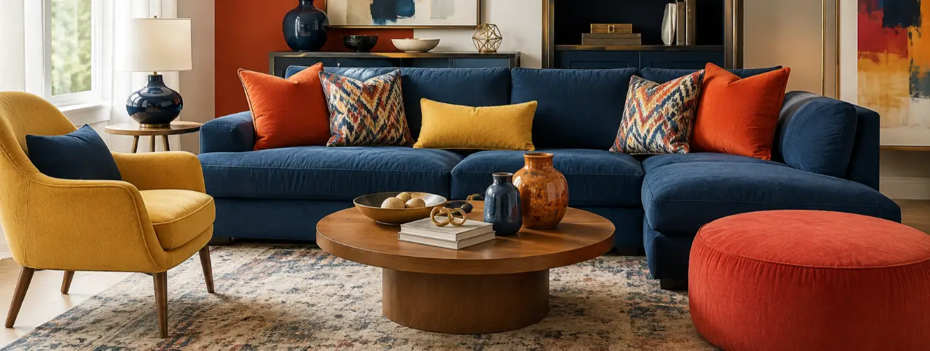
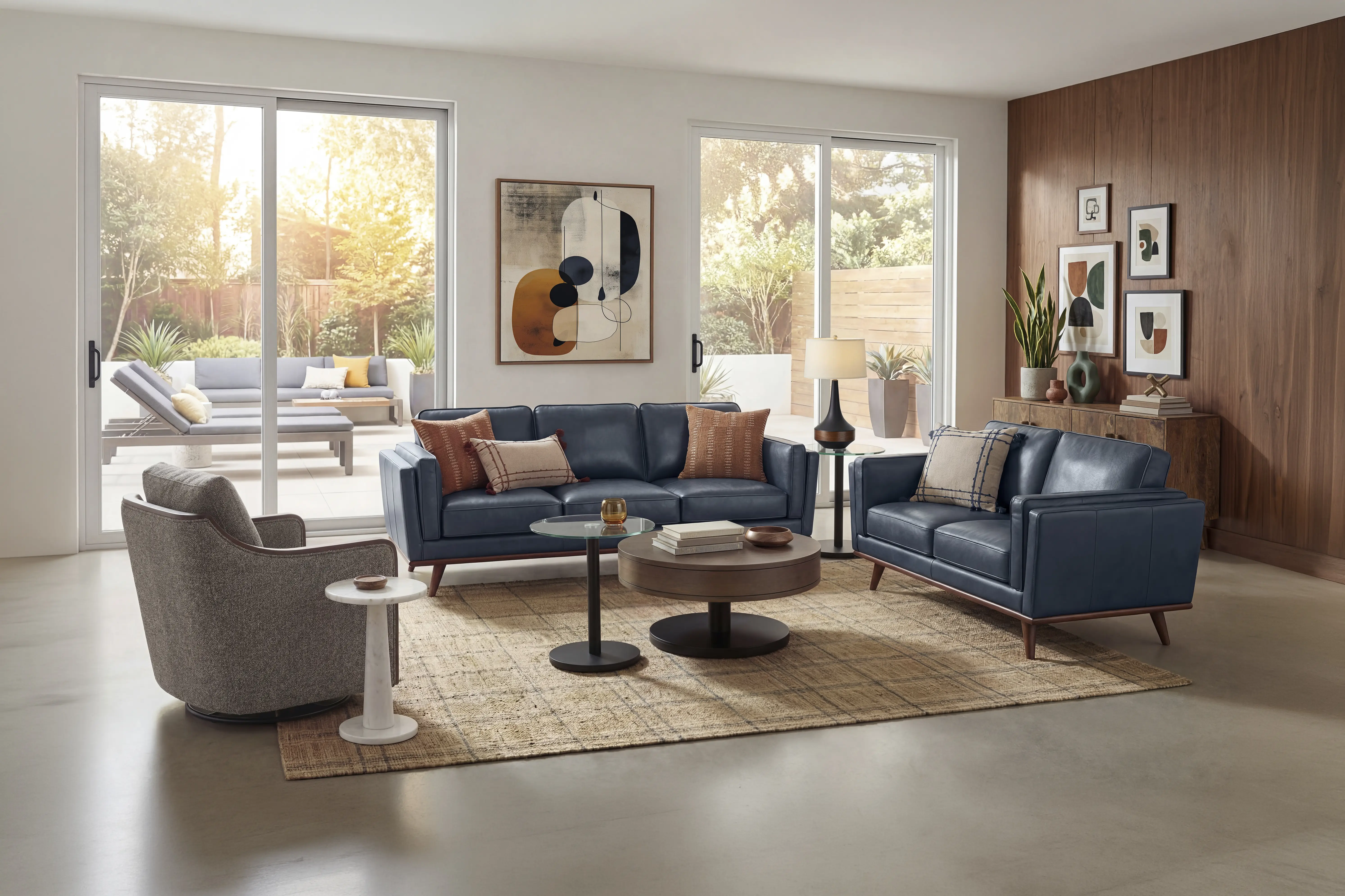
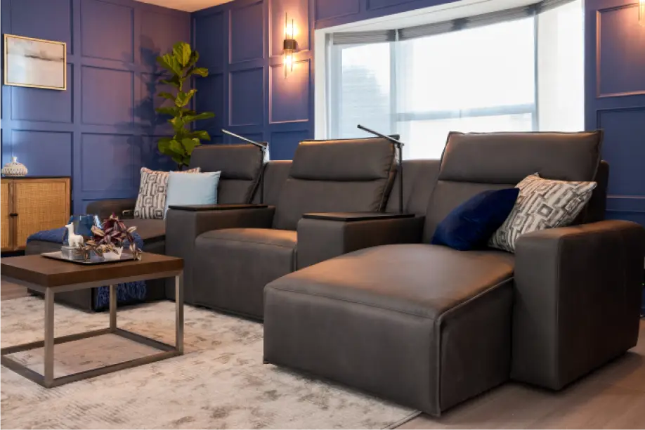
Complementary colors sit directly opposite each other on the wheel, such as blue and orange or red and green. These pairings create high contrast and energetic visual interest. A navy sofa against warm amber accent pillows is a classic example. Use complementary schemes in spaces where you want a bold, dynamic feel, like a living room or entertainment area. Rooms To Go offers coordinated furniture and fabric options to help implement bold complementary combinations in real rooms.

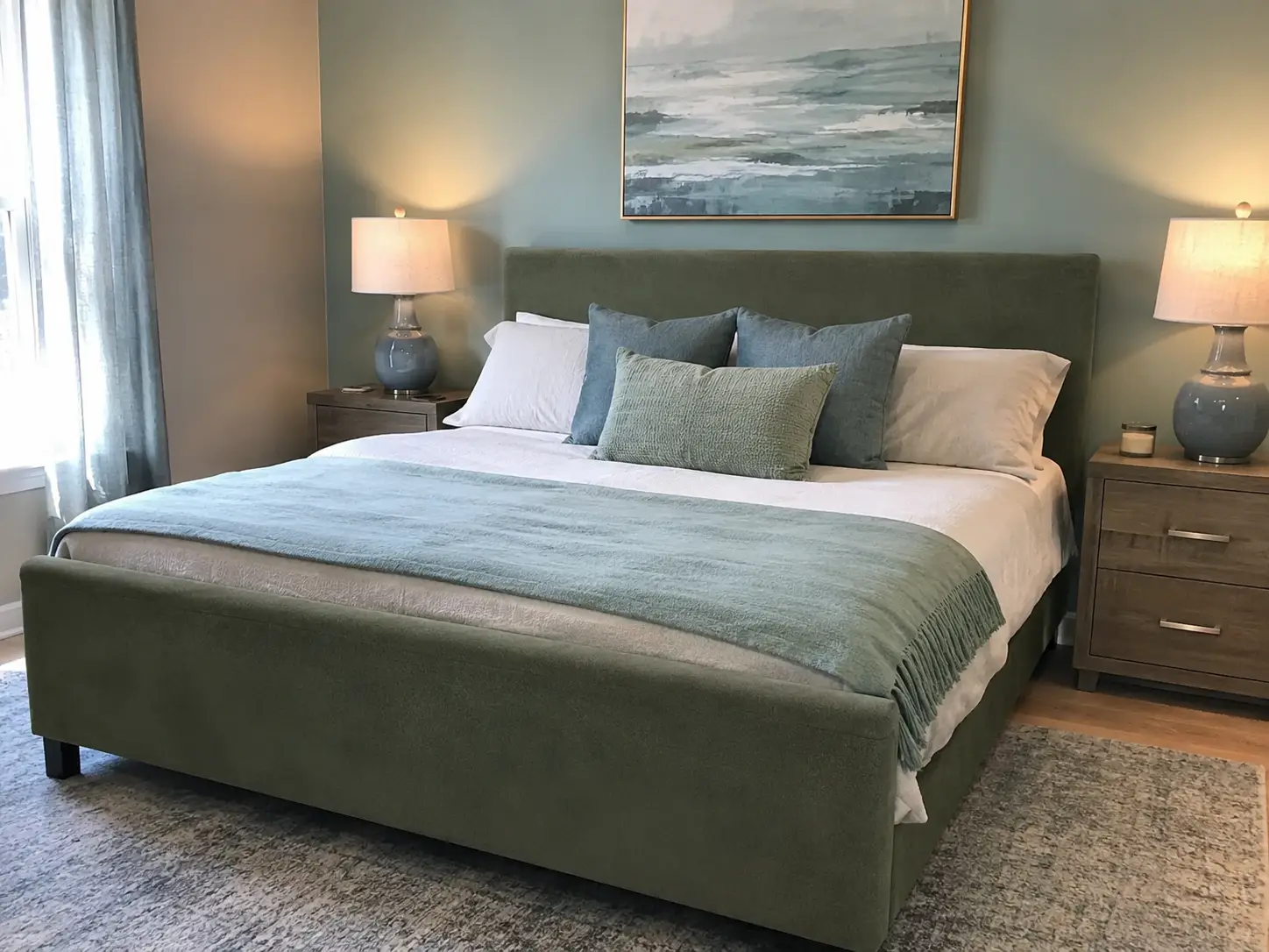
Analogous colors are neighbors on the wheel, such as blue, blue-green, and green. Because they share undertones, they blend seamlessly and produce a calm, cohesive look. This scheme works beautifully in bedrooms and reading nooks where relaxation is the priority. Imagine pairing a sage green upholstered bed with soft teal throw blankets and muted aqua wall art. Explore matching bedroom pieces and textiles at Rooms To Go to build a cohesive look.

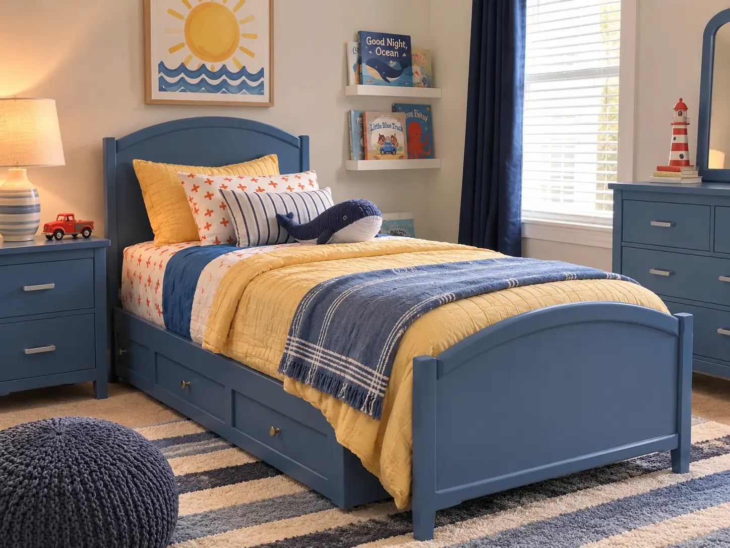
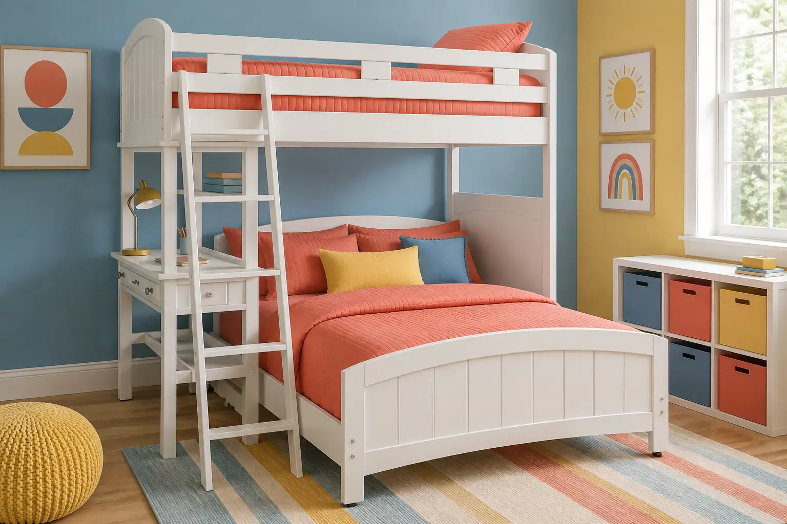
Triadic schemes use three colors evenly spaced around the wheel, like red, yellow, and blue. The result is vibrant and balanced. This approach is especially popular in kids furniture setups and playrooms, where lively color adds energy without feeling chaotic. The key is to let one color dominate while using the other two as accents.
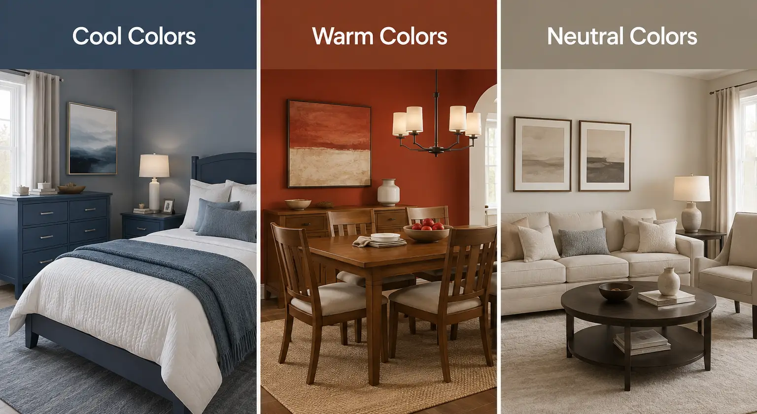
The color wheel splits neatly into warm and cool halves, and understanding this division is essential for setting the right atmosphere.

Warm colors like red, orange, and yellow evoke energy, warmth, and intimacy. They work well in social spaces such as dining rooms and kitchens, where you want to encourage conversation and togetherness. A rich terracotta accent wall behind a wooden dining table can make the entire space feel inviting.
Cool colors like blue, green, and violet promote calmness and focus. They are ideal for bedrooms, bathrooms, and home offices. A slate blue dresser paired with soft white linens creates a serene retreat perfect for unwinding after a long day.
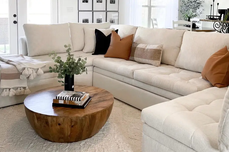
Neutral tones like beige, gray, and white act as bridges between warm and cool palettes. They provide visual breathing room and let your accent colors shine. Most well-designed rooms use neutrals as a base and layer in warm or cool accents to establish mood.
Professional designers frequently rely on the 60-30-10 rule to distribute color in a balanced way. This guideline suggests that 60% of a room should feature a dominant color, 30% a secondary color, and 10% an accent color.
Here is how this looks in practice:
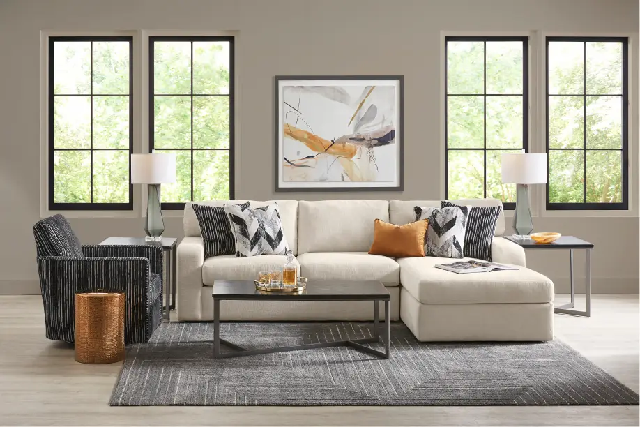
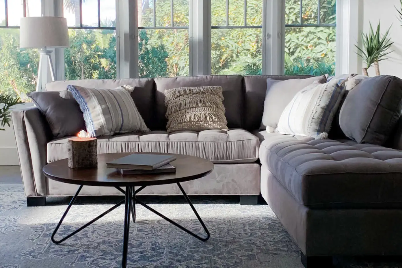
For example, a living room might feature warm gray walls and a gray sectional (60%), navy curtains and a navy armchair (30%), and mustard yellow pillows and a gold-framed mirror (10%). This ratio ensures no single color overwhelms the space while still allowing personality to come through. Using coordinated sets — like those available from Rooms To Go — makes achieving the 60-30-10 balance straightforward.

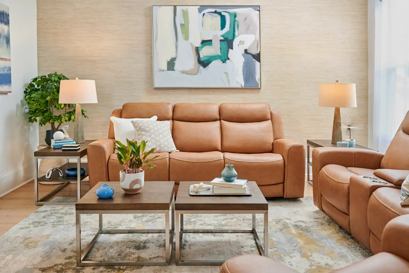
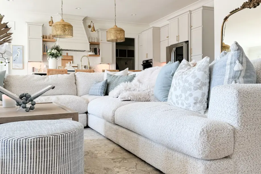
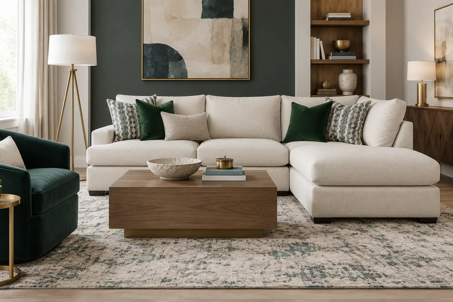
The living room is where versatility matters most. For 2026, earthy neutrals paired with rich jewel-tone accents continue to trend. Consider a warm taupe base with emerald green and brass accents. A neutral living room set provides a flexible foundation that adapts as your style evolves. Rooms To Go living room sets are designed to mix easily with accent pieces and finishes.

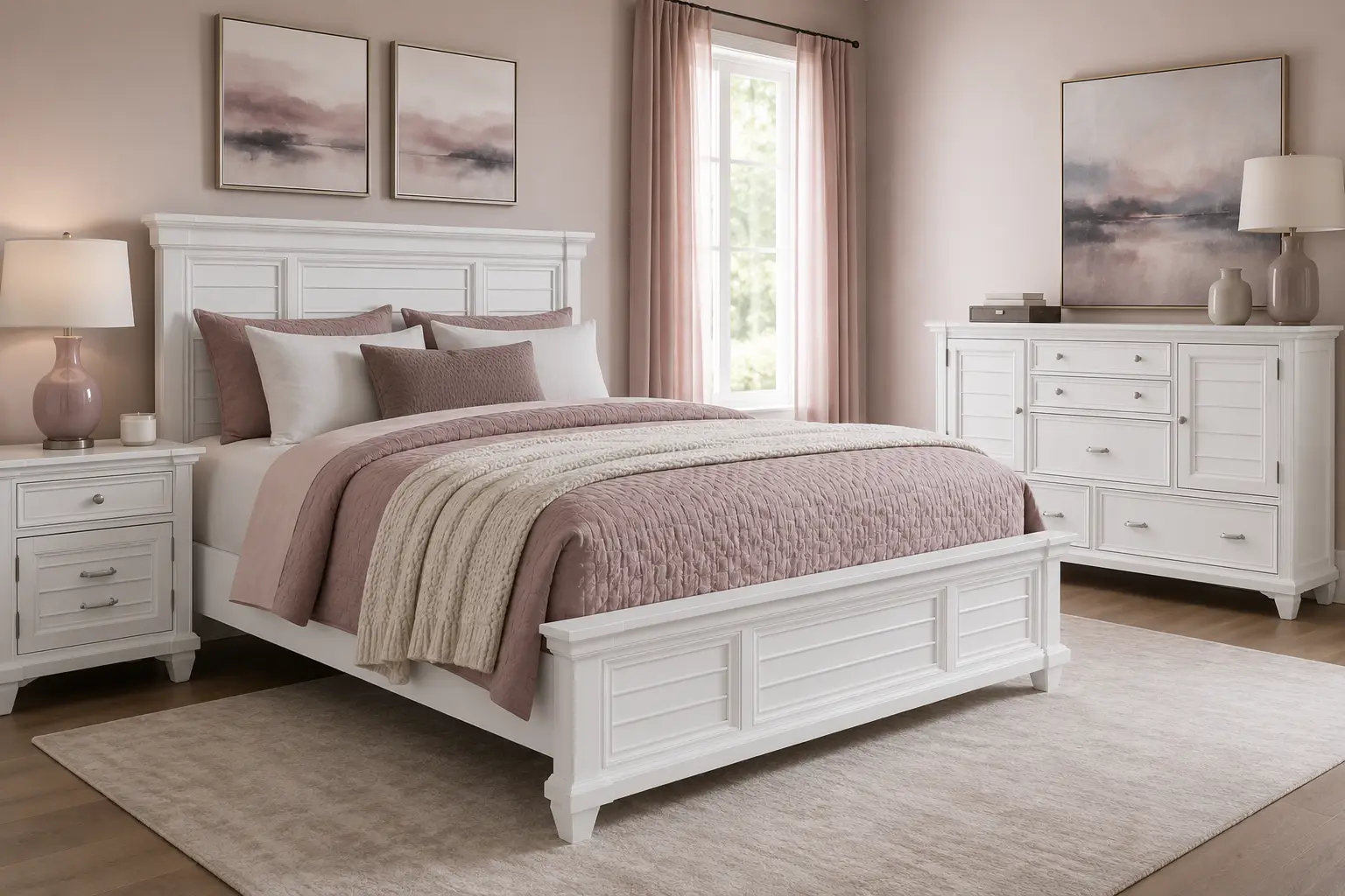
Bedrooms benefit from soothing analogous schemes. Dusty rose, soft mauve, and warm blush create a restful atmosphere that promotes sleep. Alternatively, a monochromatic blue palette, ranging from pale sky to deep indigo, adds depth without visual noise. Pair these tones with a coordinated bedroom set for a polished, pulled-together look.

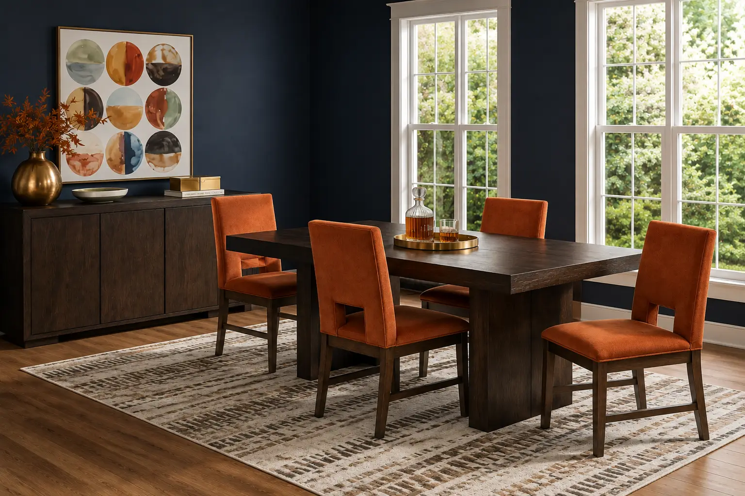
Dining spaces thrive with warm, appetite-friendly colors. A complementary pairing of deep navy walls with a warm wood table and burnt orange seat cushions creates a sophisticated yet welcoming setting. Adding metallic accents in gold or copper introduces the 10% accent layer effortlessly.

Triadic and split-complementary schemes bring playful energy to kids' furniture arrangements. Think soft coral, sky blue, and lemon yellow distributed across bedding, wall decor, and storage bins. These combinations grow with your child and remain engaging without becoming visually overwhelming.
Before purchasing furniture or painting walls, take a few practical steps to validate your color choices:
Mastering the color wheel does not require a design degree. By understanding basic color relationships, balancing warm and cool tones, and applying the 60-30-10 rule, you can create home palettes that look intentional and feel effortless. Start with one room, experiment with a scheme that resonates with you, and let the color wheel guide your choices. With the right foundation, every room in your home can reflect your personal style while maintaining harmony from space to space.